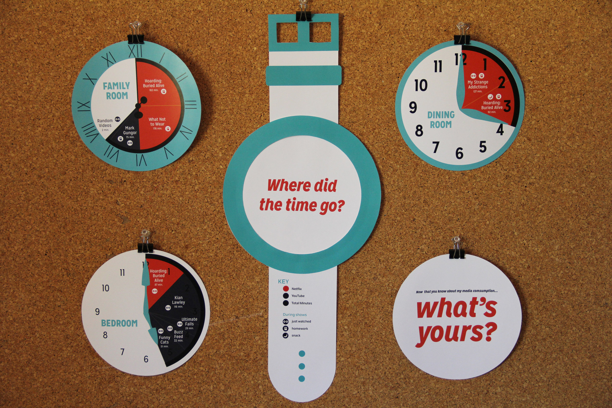

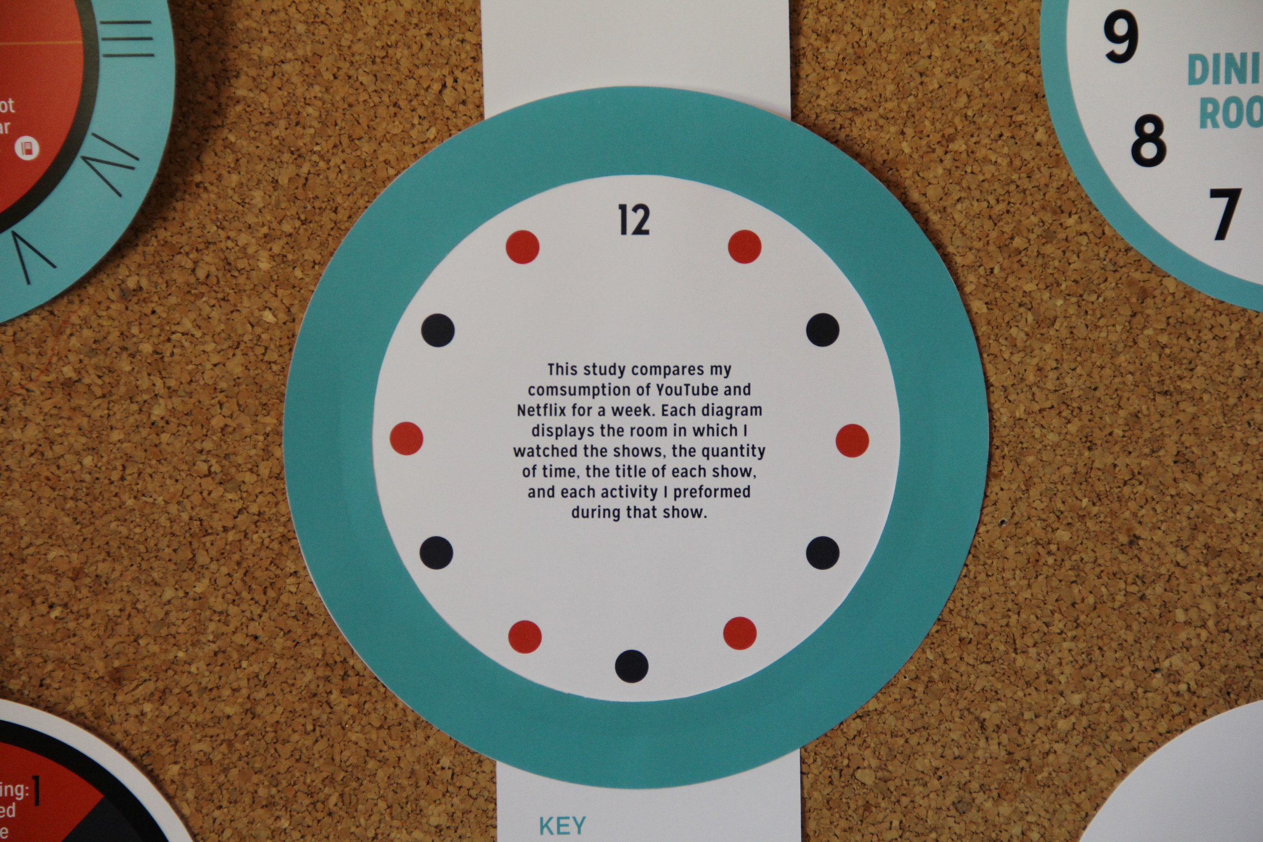


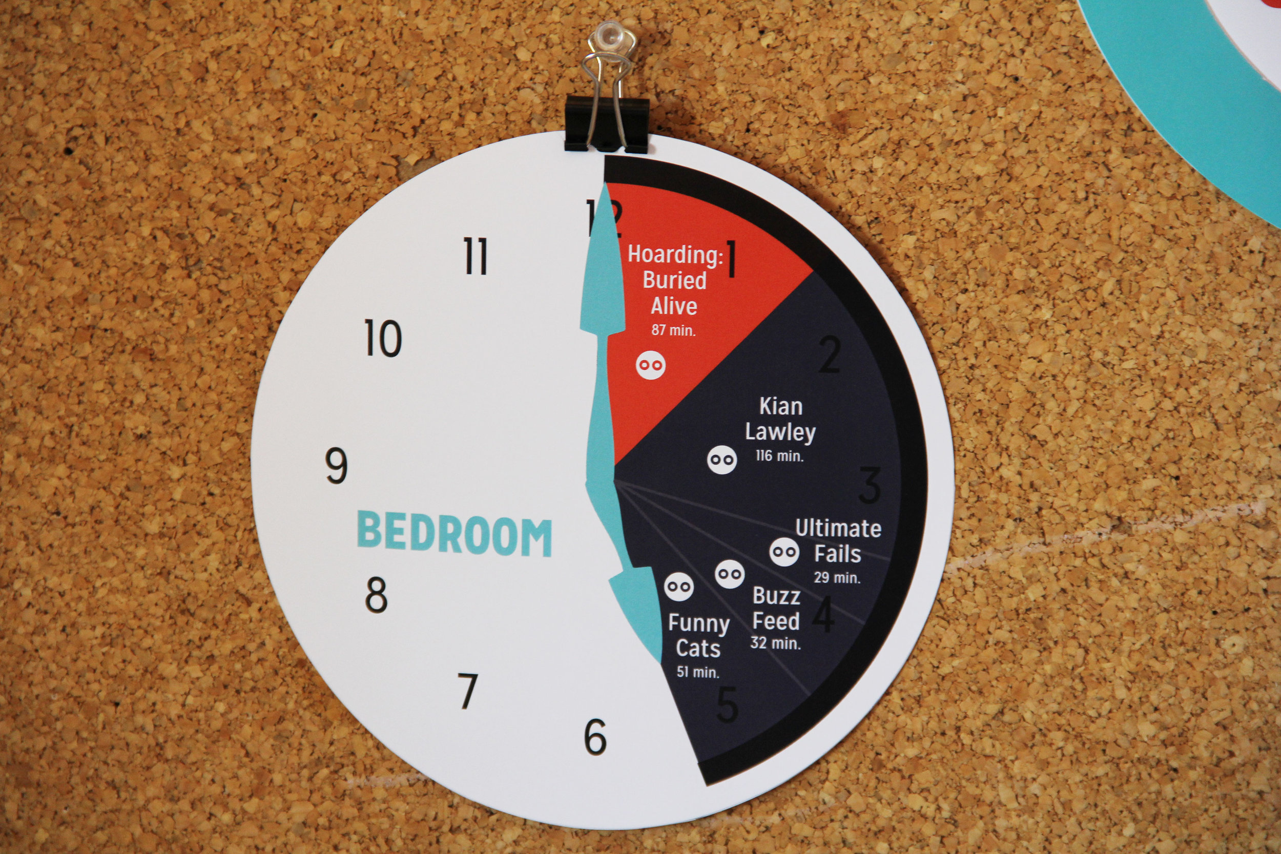
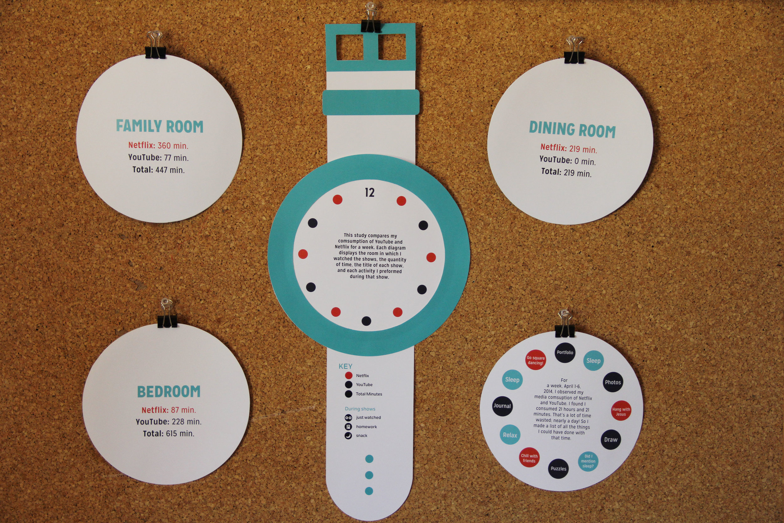
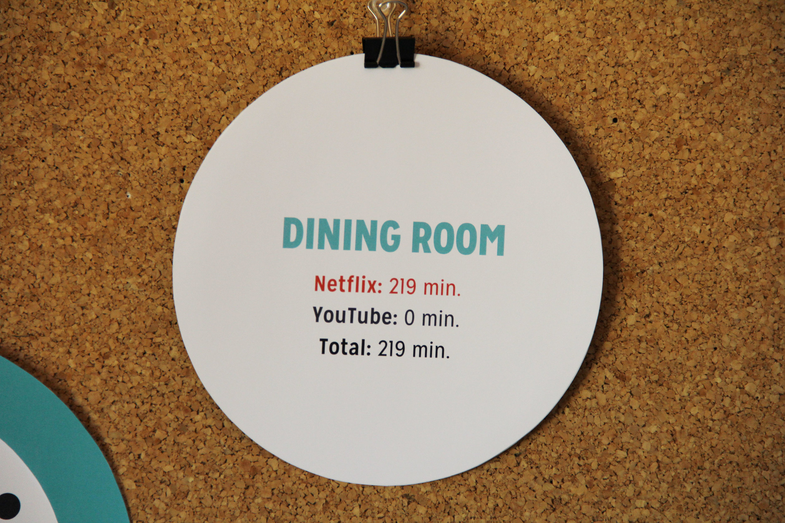
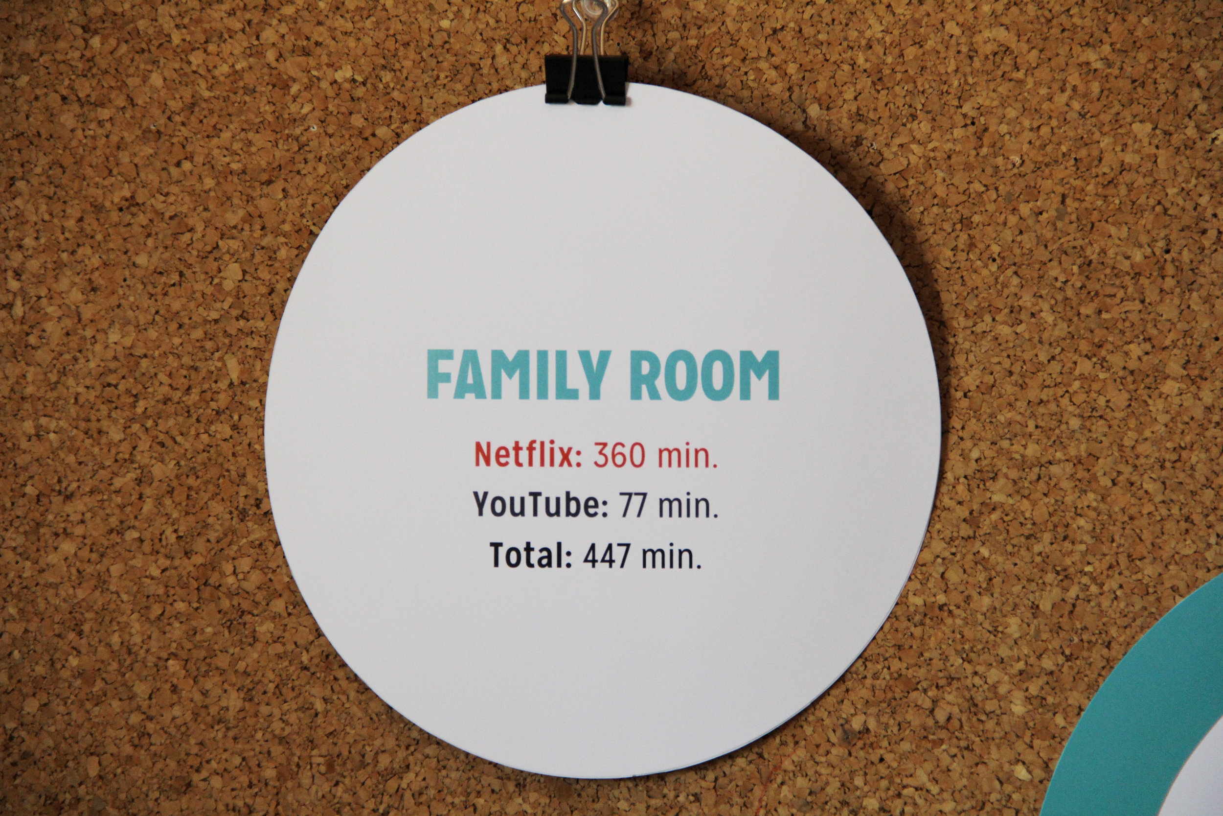
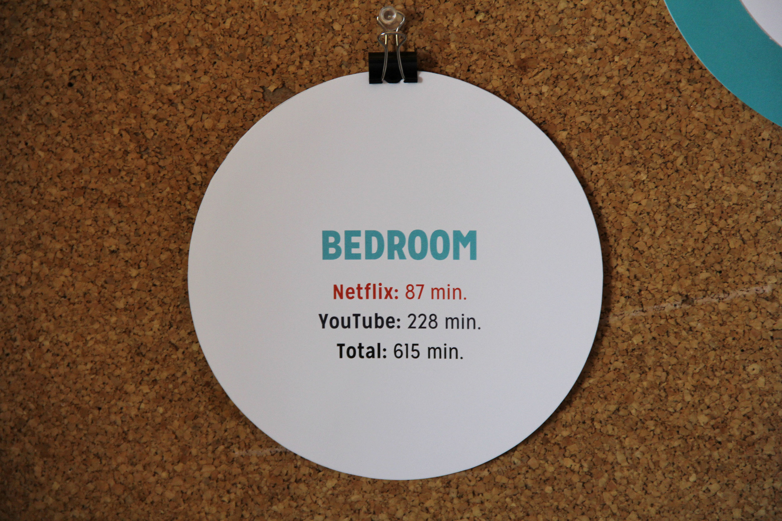
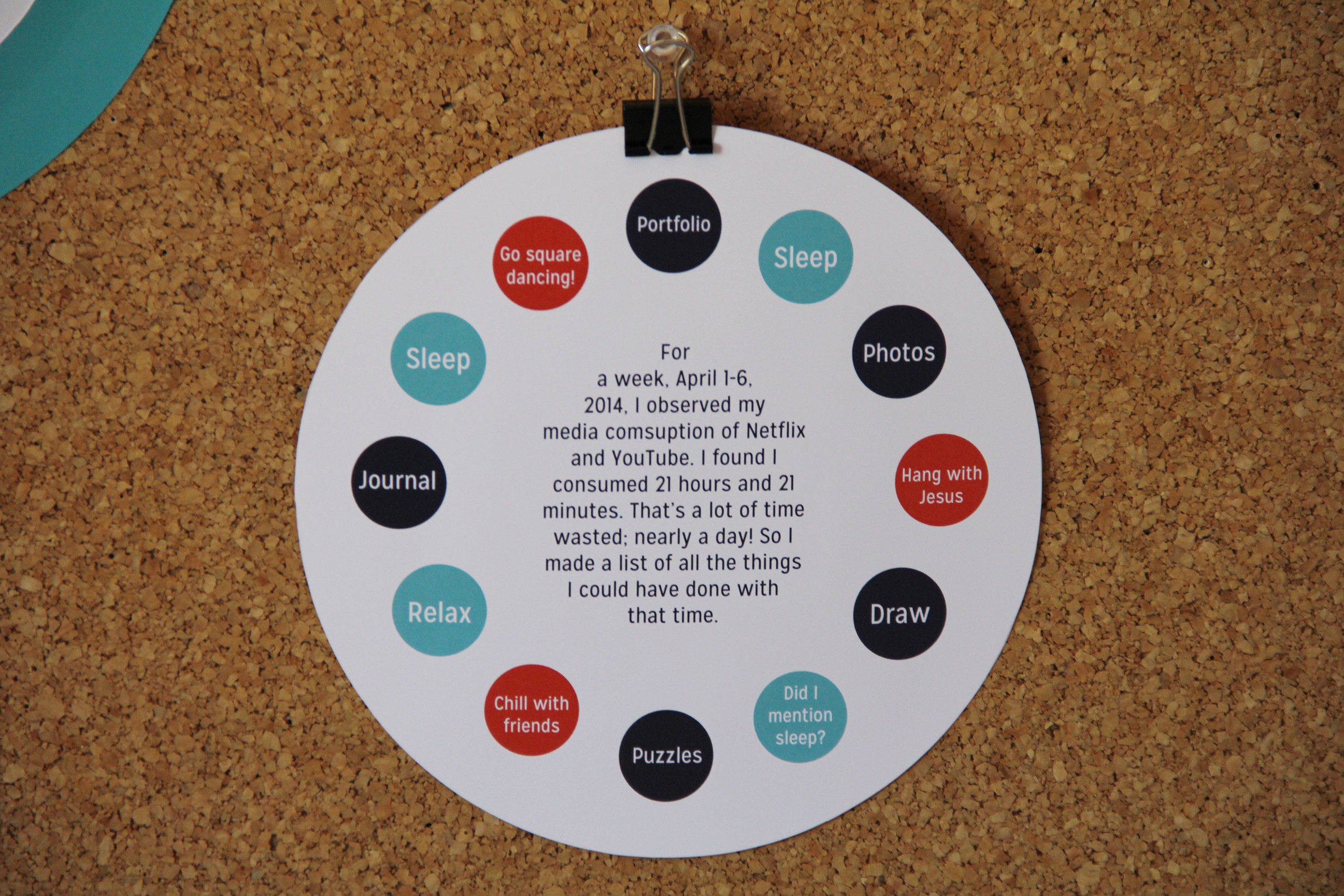
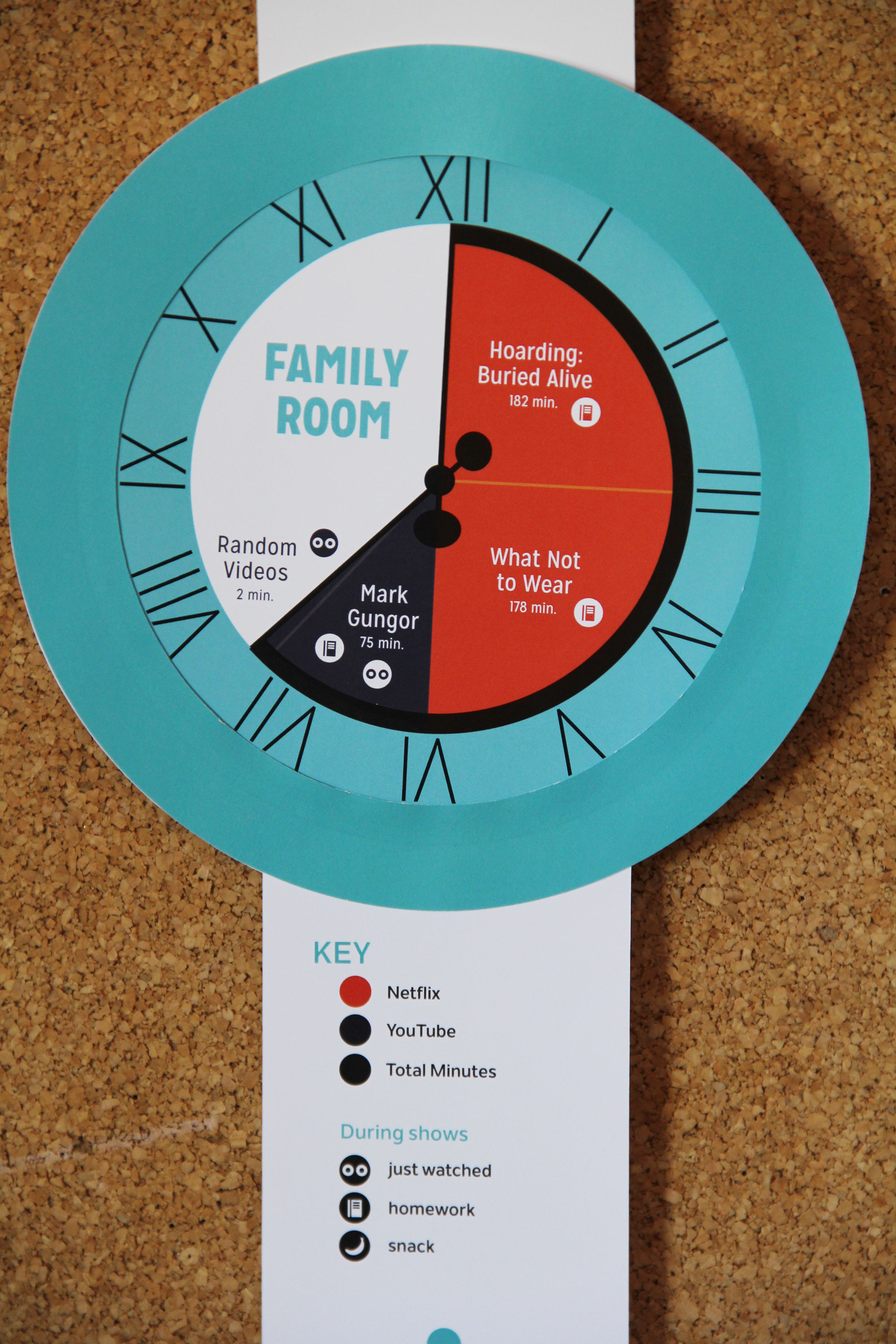
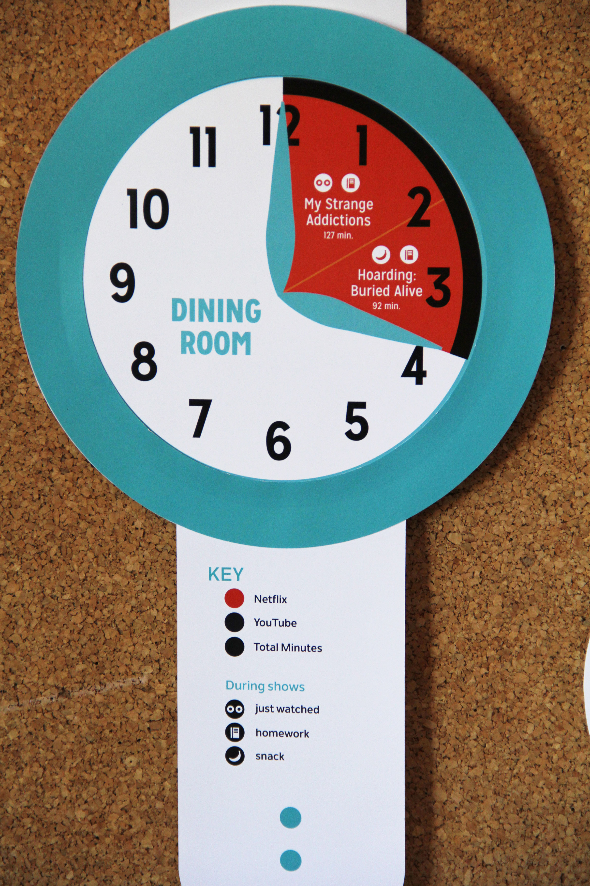
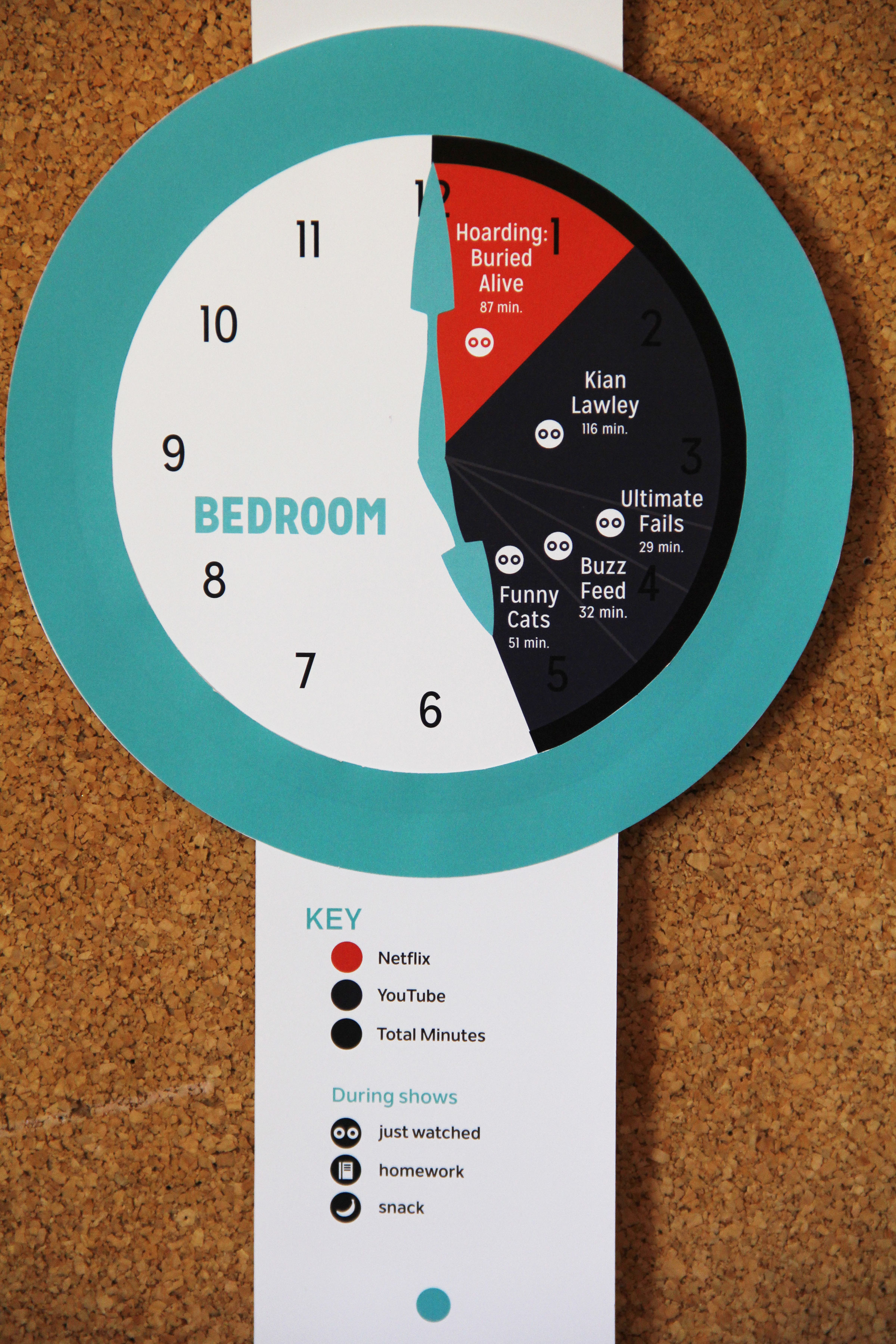
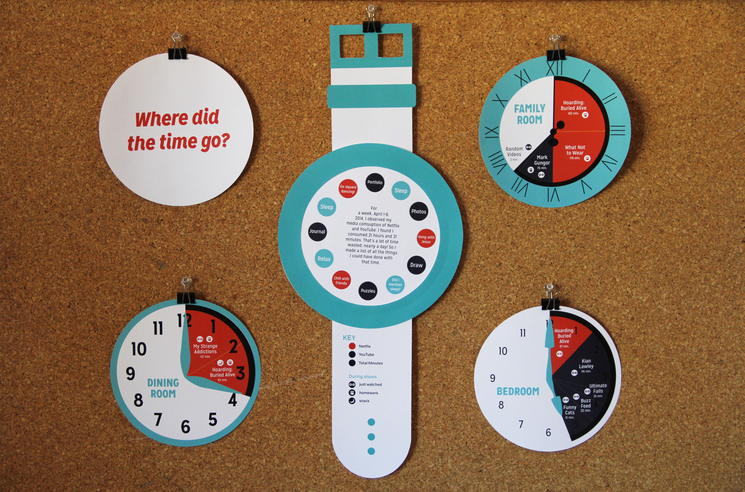
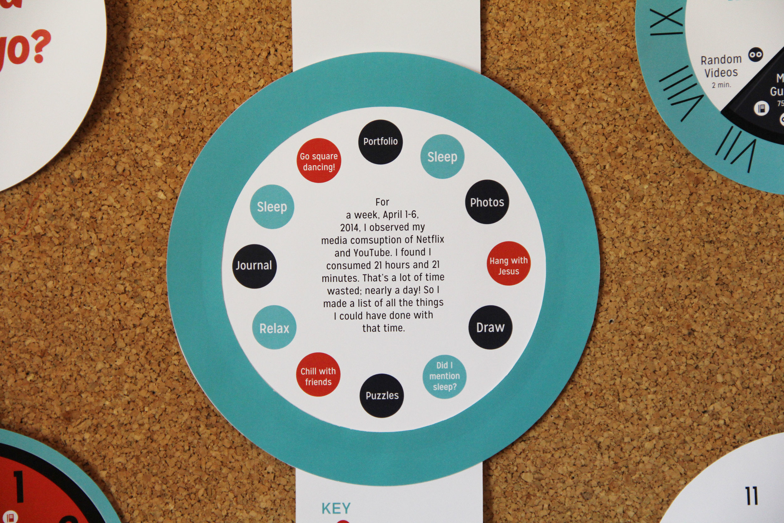
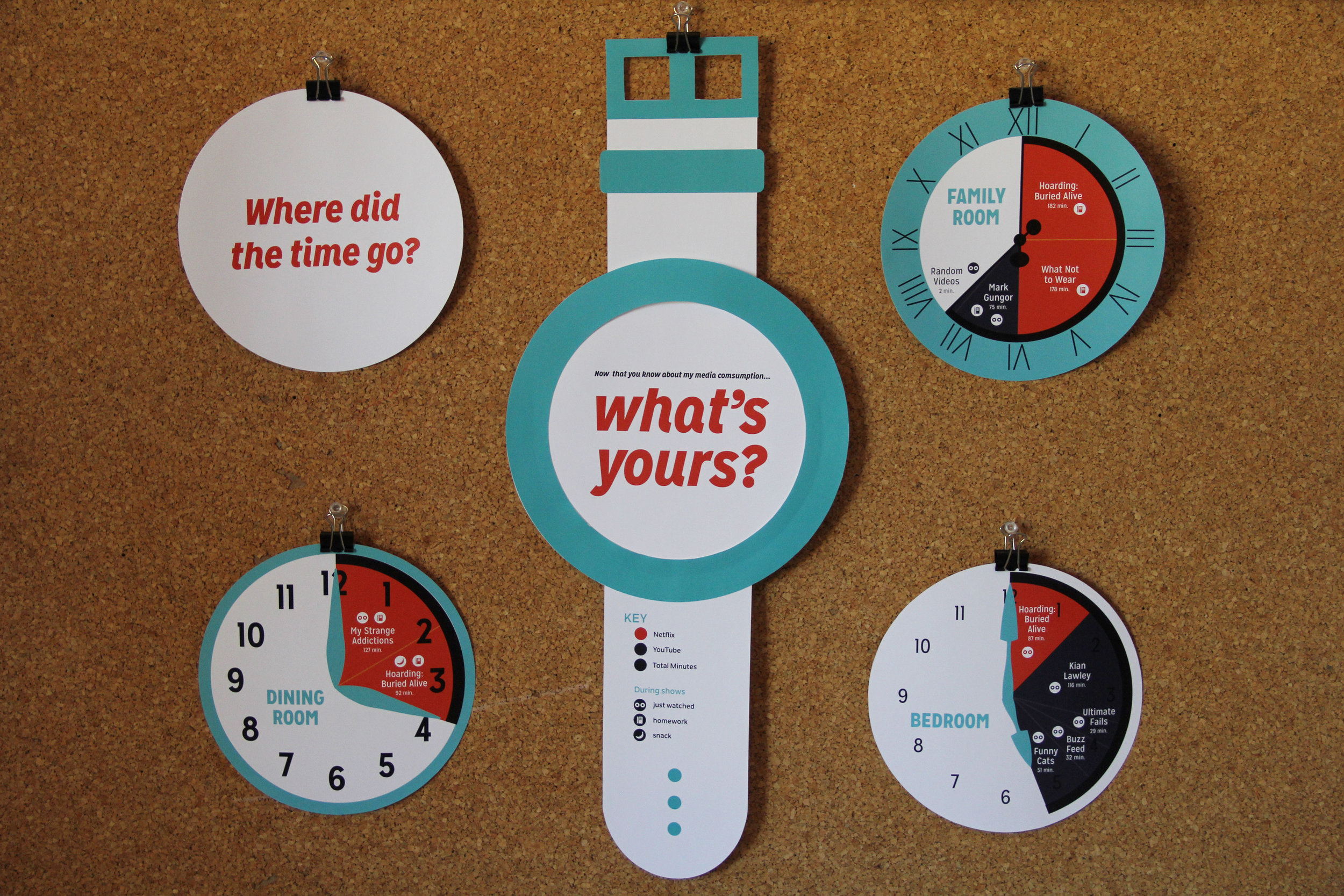

Time infographic
This infographic displays the amount of time spent on a weeks worth of media consumption. It is a comparison between two media outlets, YouTube and Netflix, the different shows watched, the rooms they were watched in, how long, and what activity was occurring during the show (snack, homework, or just watching).